
Why Minimalist Logos Are Dominating the Branding World (And How to Nail the Look) 💡
Key Learnings:
🎨 Less is More: The Rise of Minimalism in Design
📱 Mobile-First Culture Demands Simplicity
🧠 Why Our Brains Love Clean Visuals
⚡ How to Simplify Without Losing Brand Personality
🛠️ Step-by-Step Guide to Designing a Minimalist Logo
Short Summary
Minimalist logos are everywhere—from tech giants like Apple to your favorite coffee shop. But why are brands ditching intricate designs for stripped-down simplicity? This article dives into the psychology, tech trends, and cultural shifts driving the minimalist wave, plus actionable tips to craft a logo that’s clean, memorable, and unapologetically you.
🎨 Less is More: The Rise of Minimalism in Design
Minimalism isn’t new (shoutout to the Bauhaus movement), but it’s exploded in the digital age. Brands are swapping busy, detailed logos for sleek, scalable designs that thrive on screens. Think:
- Apple’s bitten apple (no rainbow stripes).
- Nike’s solitary swoosh (RIP “Just Do It” text).
- Google’s flattened, colorful “G”.
Why? Simplicity cuts through noise. In a world where the average person sees 6,000–10,000 ads daily, a minimalist logo acts like a visual sigh of relief.
📱 Mobile-First Culture Demands Simplicity
Your logo isn’t just on billboards anymore—it’s on smartwatch faces, TikTok profiles, and favicons. Minimalist designs:
- Scale effortlessly (no pixelated disasters on tiny screens).
- Load faster (critical for SEO and user experience).
- Work across platforms (Instagram to VR).
Case in point: When Mastercard removed text from its logo in 2016, it became instantly recognizable at any size—whether on a mobile app or a stadium banner.
🧠 Why Our Brains Love Clean Visuals
Science time! Studies show minimalist logos:
- Boost recognition (the brain processes simple shapes 60% faster).
- Feel trustworthy (clutter = chaos; clean lines = control).
- Enhance memorability (McDonald’s golden arches are recalled 2x more than detailed food illustrations).
Minimalism taps into the “less cognitive load, more emotional connection” sweet spot.
⚡ How to Simplify Without Losing Brand Personality
Stripping down your logo doesn’t mean stripping its soul. Here’s how to keep it authentic:
1. Start with Your Story
What’s your brand’s core message? FedEx hid an arrow in its logo to symbolize speed—proving simplicity can still be clever.
2. Edit Ruthlessly
Remove elements that don’t serve a purpose. Starbucks kept its siren but dropped the outer ring and “Coffee” text.
3. Play with Negative Space
The WWF panda or the Amazon arrow-smile—smart use of empty space adds depth without clutter.
4. Choose ONE Standout Feature
Bold color (Coca-Cola red). Unique typography (Disney’s cursive). A single icon (Twitter’s bird).
🛠️ Step-by-Step Guide to Designing a Minimalist Logo
Ready to create your own? Follow this blueprint:
1. Audit Your Current Logo
Ask: Does it work in black and white? Can a toddler doodle it from memory?
2. Research Trends (But Don’t Chase Them)
2025’s minimalist vibe? Think muted palettes, geometric shapes, and micro-interactions (tiny animations).
3. Sketch, Sketch, Sketch
Doodle 50 ideas. Then delete 45.
4. Test Across Platforms
Does it look crisp on a smartwatch? Does the color pop in dark mode?
5. Partner with a Pro
If DIY feels daunting, collaborate with a designer who specializes in minimalist magic. For example, this minimalist logo expert has transformed cluttered designs into icons that scream “quiet confidence.”
💡 Real-World Minimalist Wins
- Airbnb: Simplified their bubbly “Bélo” into a streamlined symbol of belonging.
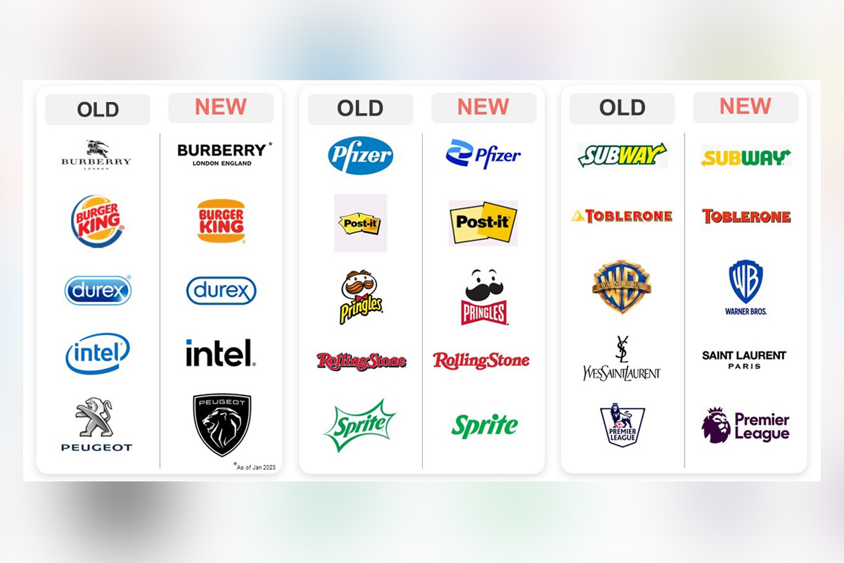
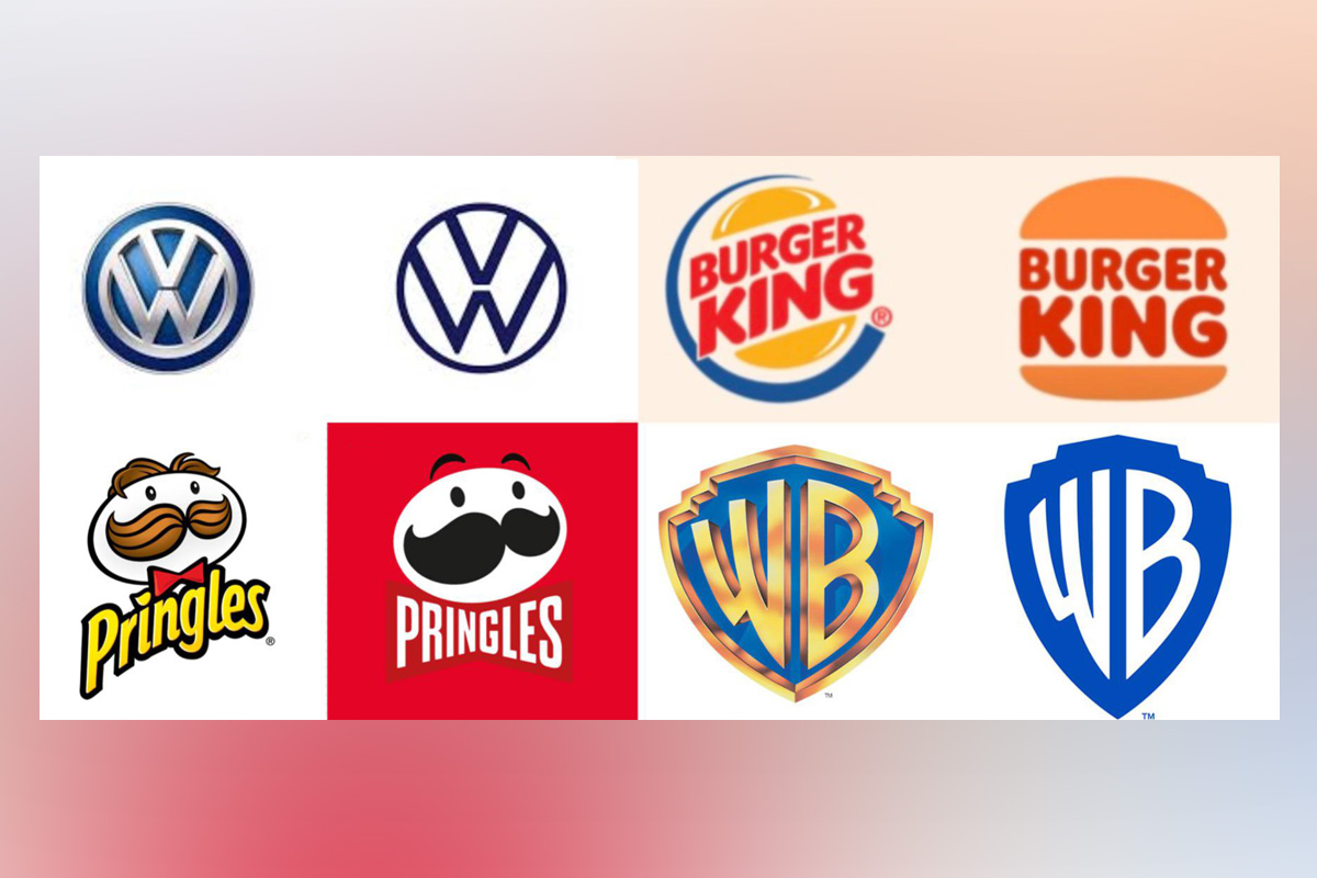
- Burger King: Swapped a cartoonish burger for a retro-flat bun that Gen Z adores.
- Calm (App): A single mountain peak that whispers “peace” in any language.
🚫 Common Pitfalls to Avoid
- Blandness: Minimalism ≠ boring. Add personality through color or shape.
- Over-Abstraction: If your logo needs a 5-minute explanation, it’s not working.
- Ignoring Versatility: Ensure it works in monochrome, animated, and 3D formats.
✨ Your Turn: Embrace the Minimalist Mindset
Minimalist logos aren’t a trend—they’re a response to how we live, scroll, and connect. By focusing on what truly matters, your logo can become a timeless asset that grows with your brand.
Pro Tip: For inspiration, explore this curated gallery of minimalist logo transformations that balance simplicity with storytelling.